Meta Careers
Coming to me with their live careers site, I was tasked by Meta to tackle two challenges:
Meta was introducing a new section to their careers site titled “Pathway Programs”. Once introduced, how would users navigate to these pages?
Meta knew what content they wanted to include, but didn’t know what the templates should look like. Using Meta’s existing design system and component library, how can the pages best be designed to tell the story that Meta wants to?
*The work presented here was completed by me and shipped late 2021 / early 2022. It does not reflect any of the changes that were made in 2023 and beyond.
01
Understanding the Navigation
Before attempting to make changes to a navigational structure, it’s important to understand what the current state is and get to the bottom of why it is the way it is, if possible. For this challenge, I was not given a lot of data to go off of, so educated guesses and best practices were my North Star. By the end of the project, I was pleased to know that my North Star was accurate.
Dissecting the navigation, at the top level, we have:
Jobs // Direct Link
Areas of Work // Mega Menu
Locations // Direct Link
Students & Grads // Simple Menu
Facebook Life // Simple Menu
Blogs // Direct Link
Site Search
With both the information about what the Pathway Programs were and what the existing navigation behaviors on the live site were, it was time to get into what navigational structure changes I could propose to the team at Meta.

02
Ideation
Knowing what I knew about the navigation, it was time to mock up some ideas of potential solutions to Meta’s problem. Keeping in mind Meta’s existing functionality was essential to ensure we could stay on track to complete the project both within budget and timeframe. Based on existing functionality, I was realistically looking at two “homes” for the proposed Pathway Programs section: Students & Grads and Facebook Life.
From a high level, Pathway Programs was targeting people beyond just Students & Grads; students and grads were a group that would be included within the Pathway Programs, but they were not the sole audience. Through process of elimination, I was left with a pretty simple direction: Pathway Programs would live under Facebook Life.
Facebook Life, Current State

Facebook Life, Solution 1

Facebook Life, Solution 2


Within Facebook Life, the internal navigation structure is pretty simple. Links are listed in a 2-column display, with each item being a direct link to their respective pages. The first approach I took was following the same 2-column approach that exists under the navigation, to ensure user confusion was limited and users could still rely on their familiarity with the site.
The first solution explores simply adding Pathway Programs within the Facebook Life navigational item, under the existing subitems. The heading of Pathway Programs would have a dual purpose: it would be a link to the landing page for the section of the site and it would serve as the header, separating the different navigational items.
The benefit of pursuing this route is that the new navigational items are visible immediately to users and they won’t be as confused if it was its own main navigation item. Users can see immediately the new options that have been added and can choose what to explore on their own.
A downside to this method is that adding new elements here without any context can lend itself to user confusion. Users both new and recurrent would see these new items and be unsure of how they fit in to Facebook Life and how they relate to the remaining navigational items.
The second solution explored a different type of interaction within the menu. Still within Facebook Life, this second solution explores a nested menu approach. After a user clicks on “Pathway Programs”, the navigational dropdown would change views to only show the Pathway Program subitems.
The benefit of pursuing this route is to clearly separate and group the Pathway items away from the other Facebook Life items. This method conveys to the user that there is a new section that has been added to the site and gives them the ability to explore this section of the site on their own.
The downside of this method, however, is that it is introducing an interaction that is not common to the navigation structure. Facebook Life will go from being a simple menu approach to having an extra layer of interaction to surface the remaining navigation items. At the same time, the nested menu approach means that all navigation items are not available immediately to the user; users need to make the conscious decision to explore Pathway Programs further in order to know they exist and to learn more about them.
03
Testing & Validation
This stage of the process was unfortunately unable to be completed due to budget and time restraints. Had there been budget and time bandwidth, the natural progression of the design process would have the user research stage next. Now that I had two different proposals of how to move forward, the way to decide which path to pursue was to do user testing and get the concepts in front of real people and gather feedback.
Testing that could be used to help verify the method would be Usability Testing, Tree Sorting, and A/B Testing. If Meta had KPIs that they knew they wanted to hit and how they would want to measure success, I would choose the research methodology that would help track those KPIs best.
04
Deployment
Going from the iteration stage to the deployment stage was very fast and easy given there wasn’t time or money to validate our assumptions and findings. After pitching both solutions to the Meta team, we landed on Solution 2, nested navigation, to be shipped.


After Meta underwent the switch from Facebook to Meta, changes were made to the Careers page, but the solution I proposed is still active on the current Meta Careers site. Facebook Life was changed to Career Programs and Students & Grads and Pathway Programs was absorbed by this main navigation item.


Pathway Program Page Templates
01
Design — Landing Page
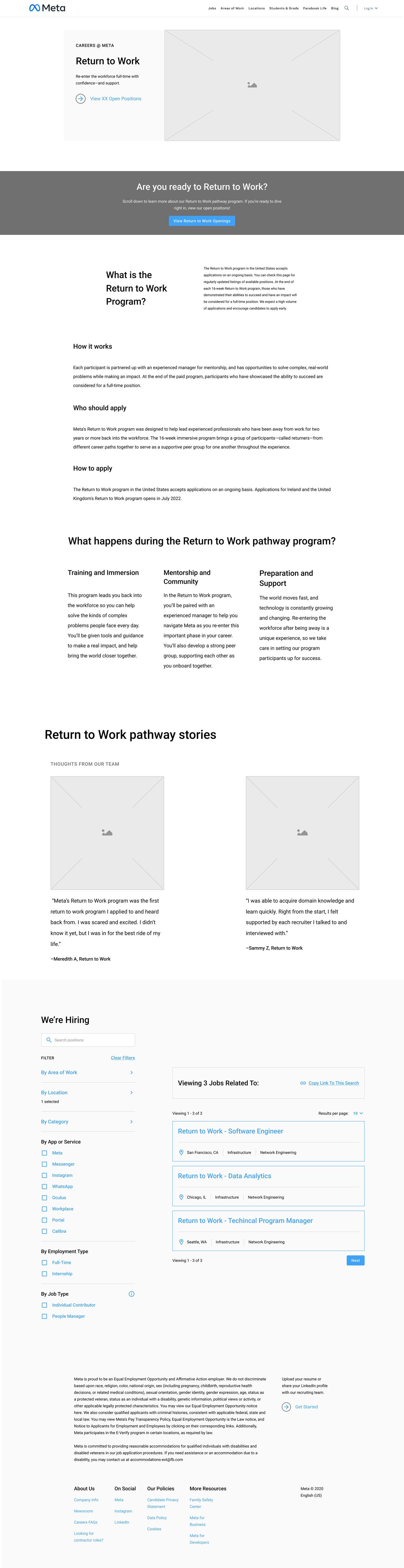
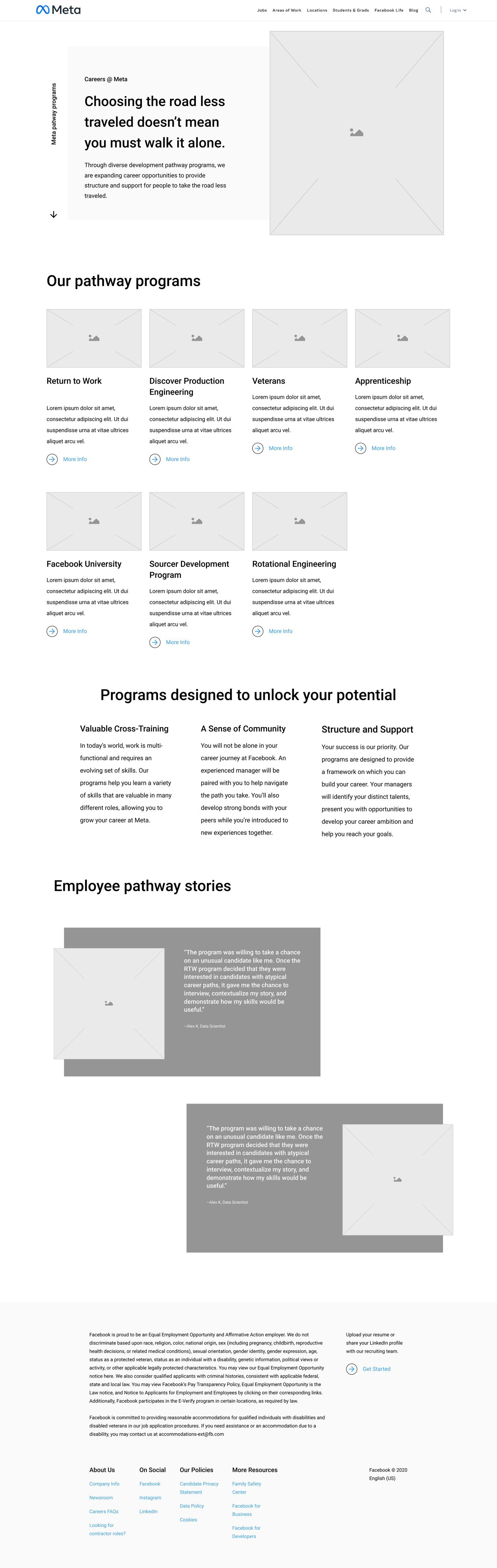
After the navigation challenge was solved, it was time to tackle the second challenge facing Meta: the Pathway Program pages themselves. Meta came to us with an established design system and a library of components, so I began working on the most fun digital puzzle I had worked on in a while. The strategy for the landing page was to provide users an overview for programs offered by Meta as well as entry points to explore the programs further.
The key to creating the landing page as well as the detail pages was flexibility: Meta wanted ways to easily tell various different stories simply by being able to switch out and move around components. After various rounds of feedback and revisions to the wireframes, this was the template that was approved to be shipped.
Live Design

Proposed Design
02
Design — Detail Page
Similar to the landing page, the detail pages were to follow the same restraints and need for flexibility: use the available components from Meta’s design library to create detail pages and allow Meta to have flexibility to swap components in as needed without breaking the overall design of the page.
The strategy for the detail pages was to provide users an overview for the specific program they were looking at as well as entry points to learn more or apply to relevant open positions. After various rounds of feedback and revisions to the wireframes, this was the template that was approved to be shipped.